Psyyyyyke. Good to see you're still working on it. It's confusing but looks okay. X3
Nice, Laxan! Did you draw that?
Art Thread
Moderator: ArcWolf
-
Blue Braixen

- Ms. Sunshine
- Posts: 5865
- Joined: Wed Sep 29, 2010 5:48 pm
- Location: Mountainous places

Re: Art Thread
Psykeout, you're doing Dada too? I'm a bit confuzzled, but I like some of the messages I can understand from there
Laxan .... *speechless*
Laxan .... *speechless*
Applegate Appearance Cheat Sheet
Haq Dzi'ab (Blue Peaks Shore) || Mikan Kawabe (Applegate) || Hajime (Apollo City)

Re: Art Thread
Some unfinished bleh-stuff

Re: Art Thread
At the moment, it should be completely un-interpretable. All the symbols are personal to me and my life, so you couldn't get most of them unless you had my memory or knew about stuff. Some stuff is obvious, like the leash or the thing about kids, but it's pretty deep stuff that if you understand, I have failed. :v When I add words, it should be more unified and have something in the ways of meaning.people wrote:The comic is confusing; I don't get it; etc.
bwah bwah

Re: Art Thread
Er, yeah? xDTha Housefox wrote:Nice, Laxan! Did you draw that?
'Cata acceptio obscuro mea ténebris ego fio totum' ~ Laxan Tanax Enore
'I made all my dark morning by the acceptance of the dark'
'I made all my dark morning by the acceptance of the dark'
Re: Art Thread
More unfinished bleh-stuff
-
Hypergenesis

- Posts: 1453
- Joined: Tue Oct 05, 2010 3:48 am
- Location: Yesterday
Re: Art Thread
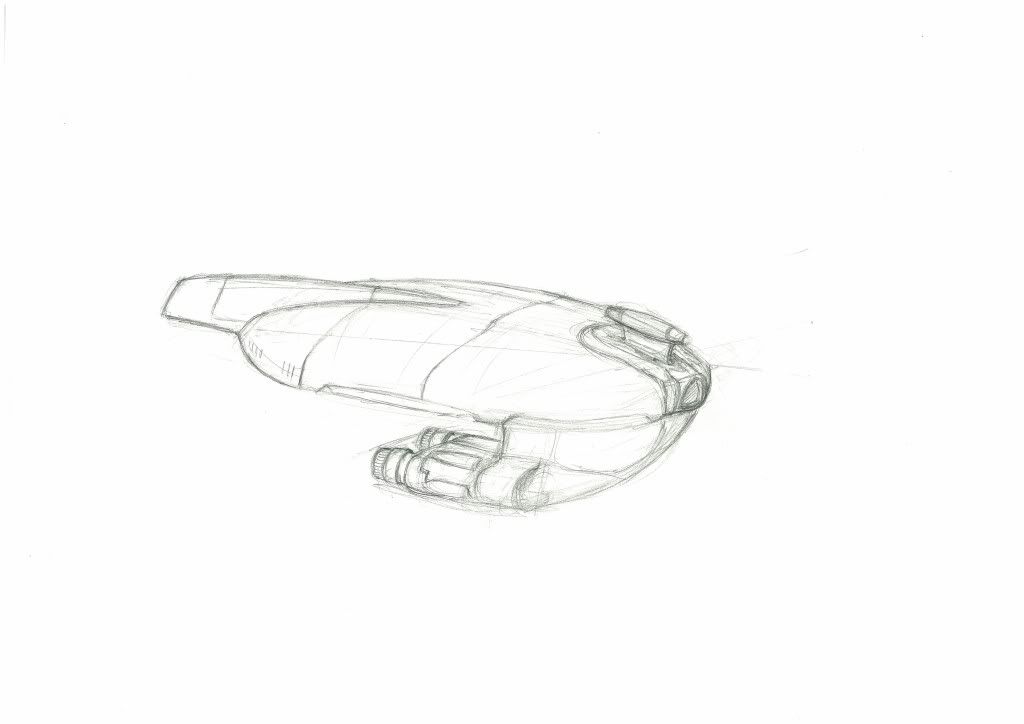
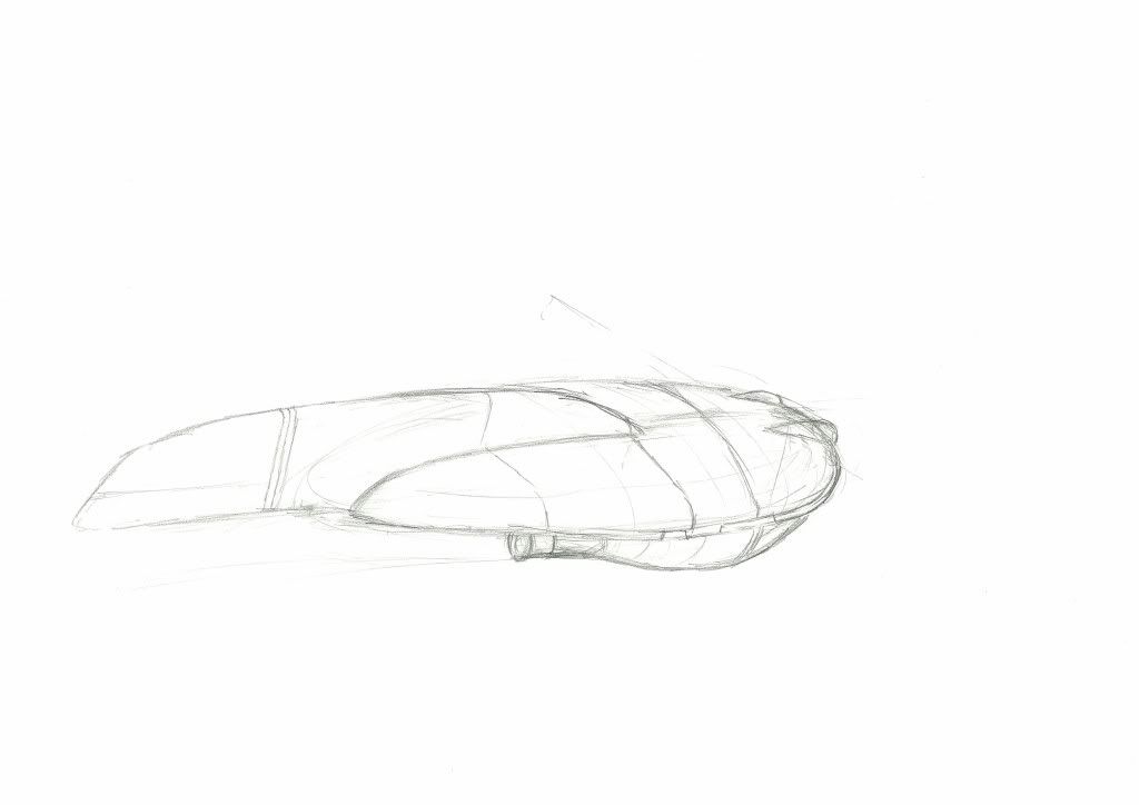
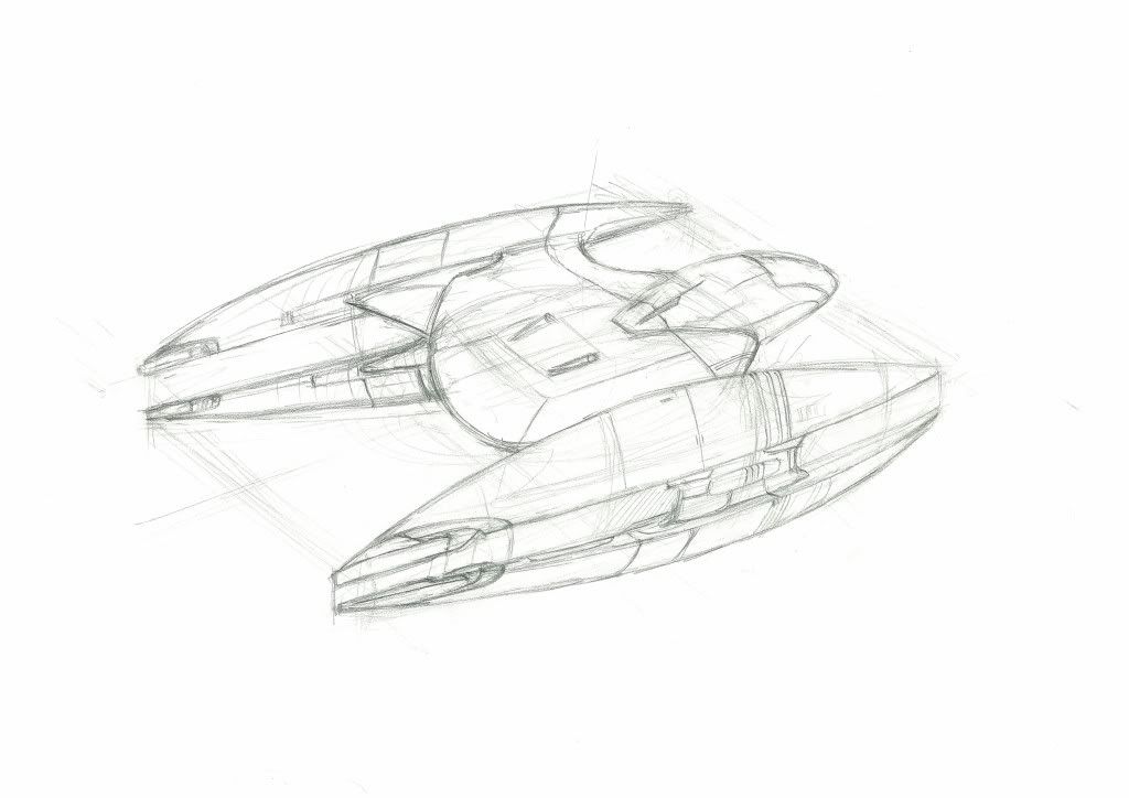
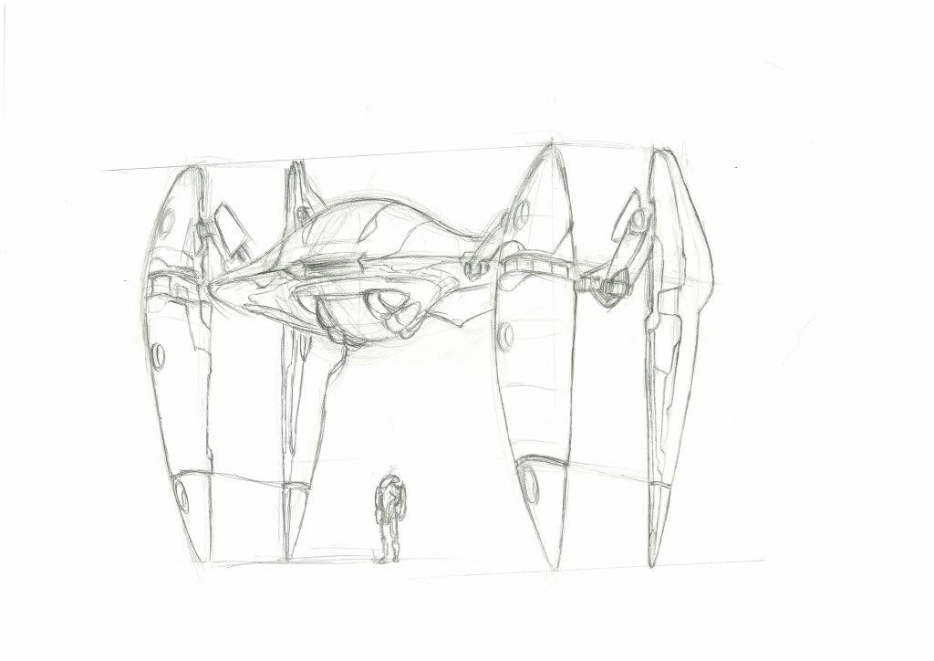
Watch out, CY-Law's going to be ruled in as Law once his Space Battleship armada arrives.
Fancy sci-fi concepts, will you be rendering them?
Fancy sci-fi concepts, will you be rendering them?
What do you mean "watch my words"? It's my tongue that I sharpened.
Re: Art Thread
lol, and it's not a concept, I have been given references for it, same with my previous similar drawings, we just need to construct it in perspective, and then render it, speaking of rendering
I might or not render it, depends, since I dun have to...
just wanna share the linework.
But oh well, on a side note: All images are copyrighted to their respective owners.
I might or not render it, depends, since I dun have to...
just wanna share the linework.
But oh well, on a side note: All images are copyrighted to their respective owners.

Re: Art Thread
*cries at the sheer awesomeness* Just awesome...Laxan wrote:
Very interesting, Psyke. Can't wait to see the finished work.

Re: Art Thread

A little something-something!
Last edited by Souji on Thu Aug 18, 2011 7:13 pm, edited 1 time in total.

-
44R0NM10

- Former Mod of the Aura
- Posts: 4011
- Joined: Mon Mar 29, 2010 5:52 pm
- Location: England
- Contact:
Re: Art Thread
It feels like I see nothing more then Arctic foxes recently...
There's too many of them. I'd be doing the world a favour by...depopulating them (inside joke)
Though yeah, awesome!
There's too many of them. I'd be doing the world a favour by...depopulating them (inside joke)
Though yeah, awesome!

-
ResTheRabbit

- Posts: 388
- Joined: Sun Mar 13, 2011 1:19 pm
- Location: Louisiana, Baton Rouge
Re: Art Thread
Finished Commission!... except... he actually wants a ton of stuff altered that he shoulda mentioned when I showed him. -_- sorta mad about that. But the coloring is decent. I'm fond of the sky... but I'm still not on par with what I want. I'm getting there little by little.
- Attachments
-
- Morgan Anime color.jpg (237.19 KiB) Viewed 14602 times


Re: Art Thread
Remember contact shadows. They make all the difference.


Fursona! :3
Don't judge each day by the harvest you reap but by the seeds that you plant.
-Robert Louis Stevenson
-
ResTheRabbit
- Posts: 388
- Joined: Sun Mar 13, 2011 1:19 pm
- Location: Louisiana, Baton Rouge
Re: Art Thread
^^' What's a contact shadow? *giggles embarassedly*Zander wrote:Remember contact shadows. They make all the difference.

Re: Art Thread
Well, I find that it is very impressive Box, except that the nose shadow... I think it's a bit TOO pronounced, I would suggest removing the line and lowering the alpha a bit more. The problem that I see (even though I am a total not-artist) is that it looks too solid, as if there were an object on his face instead of a shadow. That is only me though, please forgive me if you prefer it like that and completly disregard this not so brief comment.
Sent from my conifer.
-
ResTheRabbit
- Posts: 388
- Joined: Sun Mar 13, 2011 1:19 pm
- Location: Louisiana, Baton Rouge
Re: Art Thread
Nah, I like that comment! And I've been told that a lot. Including the guy who wanted to commission. But he said he liked it. But now he wants it gone after I colored it... so... I was a little upset he didn't ask for it to be off before I colored it, but whatevs. I'll fix it. Thanks for that Yehoshua. I appreciate it. :3yehoshua wrote:Well, I find that it is very impressive Box, except that the nose shadow... I think it's a bit TOO pronounced, I would suggest removing the line and lowering the alpha a bit more. The problem that I see (even though I am a total not-artist) is that it looks too solid, as if there were an object on his face instead of a shadow. That is only me though, please forgive me if you prefer it like that and completly disregard this not so brief comment.

Re: Art Thread
When something comes into contact with something else, there is always a slight shadow.Box O Lions wrote:^^' What's a contact shadow? *giggles embarassedly*Zander wrote:Remember contact shadows. They make all the difference.

Re: Art Thread
Gah, I missed a lot!
And I kinda missed sketching again, but I'm not really in the mood lately...
And I kinda missed sketching again, but I'm not really in the mood lately...
Applegate Appearance Cheat Sheet
Haq Dzi'ab (Blue Peaks Shore) || Mikan Kawabe (Applegate) || Hajime (Apollo City)
-
Blue Braixen
- Ms. Sunshine
- Posts: 5865
- Joined: Wed Sep 29, 2010 5:48 pm
- Location: Mountainous places
Re: Art Thread
Very nice. While looking at these, I had an immediate flashback to Metroid. X3CY_Law wrote:More unfinished bleh-stuff
Image1
Image2
Box, that's really impressive. I like. :3

-
ResTheRabbit
- Posts: 388
- Joined: Sun Mar 13, 2011 1:19 pm
- Location: Louisiana, Baton Rouge
Re: Art Thread
I've been getting faster and faster at inking. This one took me an hour maybe, if less. Looks pretty good. I've learned that altering the line weights is very important to get a good look. I meant to add a laser beam growing in his paws like from Super Smash Bros. Brawl but I forgot and I'm a little tired. ^^' Hope you like it.
- Attachments
-
- Lucario - Copy.jpg (213.36 KiB) Viewed 14557 times
-
44R0NM10
- Former Mod of the Aura
- Posts: 4011
- Joined: Mon Mar 29, 2010 5:52 pm
- Location: England
- Contact:
Re: Art Thread
Awesome lucario is really, really awesome! Great job! 
-
FlintTheSquirrel
- Posts: 2374
- Joined: Sat Mar 27, 2010 6:30 pm
- Location: Sweden/North Carolina
Re: Art Thread
Ohh so many Lucario Pictures lately, or is it just my imagination. XP Good for Aaron's soul.
Flint: Str 4, Per 9, End 5, Cha 4, Int 5, Agi 10, Luc 2
(Lucid's Drawing of Flint!)
The original idea of Flint is created by Cobalt Kitty
(Aqua's drawing of Flint!)
(Lucid's Drawing of Flint!)
The original idea of Flint is created by Cobalt Kitty
(Aqua's drawing of Flint!)
Re: Art Thread
Great stuff, everyone. The force is strong with this thread. =3
So, this is a drawing I did of my new wallaby fursona. I'm not entirely happy with it (wonky hands, wonky shoulder, wonky arm, no shading) but I thought I'd show you guys anyway.

So, this is a drawing I did of my new wallaby fursona. I'm not entirely happy with it (wonky hands, wonky shoulder, wonky arm, no shading) but I thought I'd show you guys anyway.
-
ResTheRabbit
- Posts: 388
- Joined: Sun Mar 13, 2011 1:19 pm
- Location: Louisiana, Baton Rouge
Re: Art Thread
Ruu I love it! THose feet are very well done. As for your shoulder arm problem... I'm not nagging, I'm just saying this cause you mentioned it, make a distinction between the shoulder and arm. Shoulders bulge and are round just like you have there, but the arm is not directly connected from the bulge in most cases. The arm still looks great though! I mean, I was just sayiing that cause you were disgruntled with it. I wouldn't have said anything was wrong personally cause sometimes arms do look like that too! :3 Specially love the tail.
And it's great we have a wallaby! I never thought we'd get past Rocko being the only one. X3
And it's great we have a wallaby! I never thought we'd get past Rocko being the only one. X3
-
Sleet

- Bringing Foxy Back
- Posts: 17291
- Joined: Thu Apr 29, 2010 1:32 am
- Location: Nephelokokkygia
- Contact:
Re: Art Thread
These are all great! ^_^
Questions? Comments? Concerns? Friendly banter? Feel free to click the "PM" button below!
Re: Art Thread
Now this, is a not so brief comment. *TF2 sniper voice* *shot*yehoshua wrote:......and completly disregard this not so brief comment.
Some anatomy error, i see alot of people commented about the nose so I'll start there first, from this perspective, the naris(opening of nostril) need to be more obvious, take the eye level to waist level, you'll see what I mean. Next, shadow or not, the shadow casted by the nose is off, you have shown where the light source is, in this case, I assume it's from the front of the person, so this one should be obvious. Or other wise, you'll make the nose look droopy.Box O Lions wrote:Finished Commission!... except... he actually wants a ton of stuff altered that he shoulda mentioned when I showed him. -_- sorta mad about that. But the coloring is decent. I'm fond of the sky... but I'm still not on par with what I want. I'm getting there little by little.
Anatomy wise, again, from this perspective, you have to make the ala(the bulge on the side) on the other side shown, even if it's just a little, Since, you have to make the nose shape more solid, instead of smooth rounded, same goes to the nose bridge, it has a distinct shape. I can see you try to use shading to show the form, you'll need a better shape and contrast for that, just a suggestion.
Now move on to the eye, erm, I dunno how to explain this, but you have to understand the human skull shape, the eye situated in the socket, will usually have the brow extended out more, but not exaggerating it, it prevents from making the face looks flat. You'll find out just how "inside" your eyes are towards your brain, hope you get what I mean. And also, give the eye a shape as well, by altering how the iris and pupil look like, try to imagine stamping them on a ball.
Next, anatomy again, the mouth, actually, the whole face shape is kinda off, despite me saying the face ain't flat, but they're almost a surface when viewed in general, just some bulge and dent, in this case, you need to prevent drawing the face too rounded, from what we can see, the mouth is situated in a manner that it looks like it's way lower than the nose, which is an anatomy error. And you have to make sure the construction is correct, the placement of mouth is off if compared to where the eyes and nose are. In this case, the mouth would be higher up and closer to the left(from viewer point of view), from an almost 1/4 front perspective view, this is something you need to take care of.
And then, to the whole head anatomy, i say.... try imagining the person have his hair shaved, and imagine how the head is connected to the neck and the body, you'll see what i mean, the head is connected from its base, not from its back, just imagine the spinal cord connected the brain, easy reference, and again, make sure the head isn't round, it has a more dynamic shape, again look for reference.
Then, the hair, I say, good attempt, but you gotta show its volume, strokes are too soft in terms of colouring, I can see the shape, but not the form, making it not so convincing, as it can be misunderstood as a flat piece of paper, and also, show the contrast between each side of the hair, the lighting applies here as well, but nevertheless, good attempt as I'm not fond of drawing hair either, not even colour.
I wouldn't comment on the clothe, nothing much, aside from making it more contrast, since it's a white clothe.
And the right hand, the form is distorted, suggesting to find reference, best doing the gesture yourself, the palm being pressed needs to show its form correctly, I can see the attempt, but it's off. and the fingers...I assume it's a human error, but the fingers are poking/penetrating through the handle of the keyblade for some reason.
Next, I'll say this as an extra. Look at how he stands and how he positions his keyblade, he could be easily off-balance, but it's just something not *so* significant.
And well, over all you incorporate a soft shading method, which is ok, but it's better, for this case, for you to show some contrast, I assume it's sun light hitting on him, you'll have to simulate that, it's a tad way too soft, but it's just me.
And maybe add in more details, I know it's a commission and that you have to present it in a limited time. But simple stuff like, showing the bump where the hand-in-pocket is, will help, even by abit.
Overall, a tad shading problem, but a concerning matter is the line quality, you have to know for yourself which line is important and which line is not, it determines how the strokes is applied, Ex. stuff under shadow have a heavier and thicker line. Outer line is thinker than line for details, etc. It helps show the form easily and *not* confuses the audience, most of the time. Vector outlining or pen tool outlining is great, as it simulates pressure, but you gotta take care of the strokes as well, make sure it looks convincing, instead of letting the audiences wonder which line indicates the outline, and get confused by the form and structure, giving a false illusion of volume. And still, be flexible in this, you'll never know what went wrong until you finish it, most of the time.
Overall, I have nothing else to say, still, a good attempt, since quite a number of people points out stuff about it, just pointing something out as well.
Note: 1)If everything you did is stylised and is for a purpose, then... ignore what I said, but might be helpful for others
2) I typed this as I go, so it might be slightly inaccurate or even missed out something, I apologized about that
3) So that said, if there's anything I said that you don't understand or wish to ask, I'm here
4) I know I did threw lots of gibberish technical stuff, most of the people get offended by it, so no offence despite of what I said
Ironically how I just mentioned about line quality(I started this comment before you post this lol xD), this is close to what I meant, good attempt, but still, there's still some error here and there about the line, which, I'll leave it up for you to find it out yourself. It's a very important aspect to show an uncoloured detailed work, applying the correct line, in the correct place. The thing is it's uncoloured, which in turn, line quality took on the role of determining the shape and form, letting the audience know what they're looking at is convincing enough.Box O Lions wrote:I've been getting faster and faster at inking. This one took me an hour maybe, if less. Looks pretty good. I've learned that altering the line weights is very important to get a good look. I meant to add a laser beam growing in his paws like from Super Smash Bros. Brawl but I forgot and I'm a little tired. ^^' Hope you like it.
But otherwise, it looks good, I usually won't say much about stuff non-human. but oh well.
Again, no offence. |D
Re: Art Thread
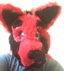
Nice Lucario, Box! Looks like he is about to go berserk on some poor pokemon! 
Ruu! So that's what you look like. I wondered. Nice to know what your fursona looks like.
Ruu! So that's what you look like. I wondered. Nice to know what your fursona looks like.
Re: Art Thread
This is just a drawing of Frederic Chopin that I did. http://www.ratemydrawings.com/drawings/ ... 09921.html If you're wondering why the 19 year old version doesn't look quite like its reference, it's that I thought the photo reference, even if he was ill at the time, would be truer to his actual facial anatomy than some painter's idealized version of him The two main issues I have with many of the paintings of Mr.Chopin or other of other people living at that time are the abnormally almond shaped eyes and thin bridged noses. Basically, something like this http://www.cracow-life.com/media/pics/chopin.jpg looks anatomically weird to me but I suppose that was the style of the time. Have you ever noticed how two completely different artists who both draw/ paint in a realistic manner can draw/paint the same person and the two portraits look like completely different people? Maybe it's just me or maybe not? As artists, what is more important to you, being able to accurate portray the personality of the person in a portrait (this can also apply to fictitious characters) or being able to render the facial proportions correctly. Could it be that you have to understand a person's personality in order to draw them properly or am I wrong? I feel like even if I I could draw with expert technical finesse my drawings could still be bad because the message I sent in my drawings was not what I intended. I have no idea at what point this occurs but it's when a story becomes more than a collection of words, a piece of music more than a collection of notes, and a drawing more than collection of line strokes. You know, I think Rick wrote something about this matter in one of his news posts. *checks Housepets! news archive* http://www.housepetscomic.com/2010/04/2 ... mes-r-art/ yes, that's the one.
@Coatl_Ruu A wallaby, huh? That's cool. I don't really see a lot of drawings of them. In regards to marsupials, I find a lot more kangaroo drawings though it could be I haven't searched diligently. Hmmm, DA says 2066 most poplar deviations for wallaby, 324 most popular deviations for wallabies, 15210 most popular deviations for kangaroo and 1795 most popular deviations for kangaroos.
@Coatl_Ruu A wallaby, huh? That's cool. I don't really see a lot of drawings of them. In regards to marsupials, I find a lot more kangaroo drawings though it could be I haven't searched diligently. Hmmm, DA says 2066 most poplar deviations for wallaby, 324 most popular deviations for wallabies, 15210 most popular deviations for kangaroo and 1795 most popular deviations for kangaroos.
-
44R0NM10
- Former Mod of the Aura
- Posts: 4011
- Joined: Mon Mar 29, 2010 5:52 pm
- Location: England
- Contact:
Re: Art Thread
Wow, Roo, that looks really awesome! Gotta love an awesome wallaby
Re: Art Thread
Hee. Thanks! ^_^44R0NM10 wrote:Wow, Roo, that looks really awesome! Gotta love an awesome wallaby
Ah, see, I knew as I was drawing it that something about the shoulder just looked off. Now I know what it is. You're not nagging at all, that's very helpful. Feel free to point out things like that on ANYTHING I put up here, not just the stuff I already pointed out. I can't fix it if I don't know I'm doing something wrong! =3 And I think the feet and tail were my favorite bits as well. Or at least the pasts I thought I did the best on. =PBox O Lions wrote:Ruu I love it! THose feet are very well done. As for your shoulder arm problem... I'm not nagging, I'm just saying this cause you mentioned it, make a distinction between the shoulder and arm. Shoulders bulge and are round just like you have there, but the arm is not directly connected from the bulge in most cases. The arm still looks great though! I mean, I was just sayiing that cause you were disgruntled with it. I wouldn't have said anything was wrong personally cause sometimes arms do look like that too! :3 Specially love the tail.
And it's great we have a wallaby! I never thought we'd get past Rocko being the only one. X3
-
Sleet
- Bringing Foxy Back
- Posts: 17291
- Joined: Thu Apr 29, 2010 1:32 am
- Location: Nephelokokkygia
- Contact:
Re: Art Thread
I can't believe I didn't see this posted in here earlier. I think this is awesome!Souji wrote:
A little something-something!
*hugs his/her two Arctic fox friends*
Questions? Comments? Concerns? Friendly banter? Feel free to click the "PM" button below!
-
Blue Braixen
- Ms. Sunshine
- Posts: 5865
- Joined: Wed Sep 29, 2010 5:48 pm
- Location: Mountainous places
Re: Art Thread
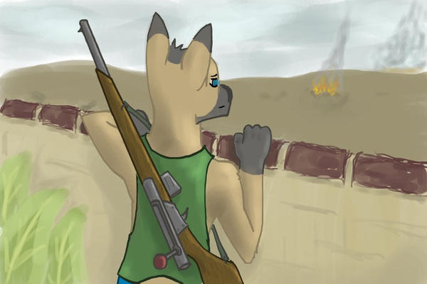
Aaaaand here's another one! When I drew it, I tried a new inking style. Personally, I think it looks cool. The shading worked (and made the rifle look downright sexy)... all in all, I'm pretty happy with this. Well, except for the right hand. But I never like my hands, so ... =P
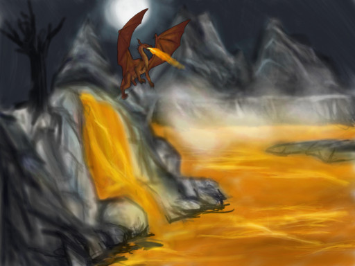
Ruu stares over the cracked, dusty wall into the waste beyond. His rifle, still barely used, feels heavy and awkward slung over his back. There has been no sign of the enemy for days, only the great fire on the horizon.
He'll be stuck here on sentry duty until the division regroups and sets out yet again on their general's glorious campaign. Setting out for a victory they were promised was close at hand, but never seemed to be within their grasp.
Sighing, mentally cursing the fate that brought him here, Ruu rests his head on the ancient wall and stares into the waste. Into the scorched battlefield, the blasted heath.
Into no-man's land.
Last edited by Coatl_Ruu on Fri Aug 19, 2011 3:28 pm, edited 1 time in total.
-
Blue Braixen
- Ms. Sunshine
- Posts: 5865
- Joined: Wed Sep 29, 2010 5:48 pm
- Location: Mountainous places

Re: Art Thread
Ooohh, that's nice Coatl! I've always wanted to try outlining like that. xD Should try it out sometime.
And here's a doodle. Trying to build my motivation in drawing back with a new style, maybe.
Just trying it more on the expression for the meantime though. I'll work on the body itself later or sometime.
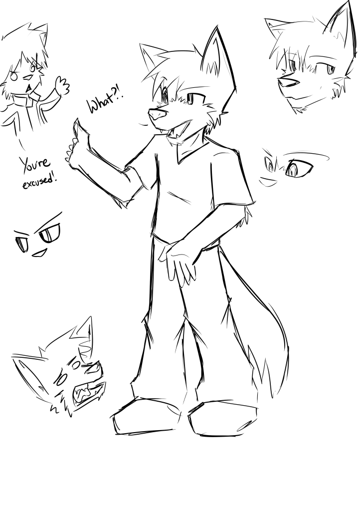
andlolrandomVadiant. *bricked*
And here's a doodle. Trying to build my motivation in drawing back with a new style, maybe.
Just trying it more on the expression for the meantime though. I'll work on the body itself later or sometime.
andlolrandomVadiant. *bricked*

Re: Art Thread
Gah, too much greatness to comprehend! @_@
Ruu, your fursona is awesome! And the inking style in the battle scene looks great too!
Nick, I'm glad you're drawing again! =3 The expressions look good too!
Souji, you're going to spam the place with Arctic foxes sooner or later... it's not a bad thing either! ^^
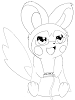
Psykeout, she looks like someone from this animated series, I just can't remember who...
Law, I agree with what Nitz said, you're planning to take over the world or something? X3 *bricked*
Box, regardless of the comments, I really like how you colour the lineart!
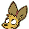
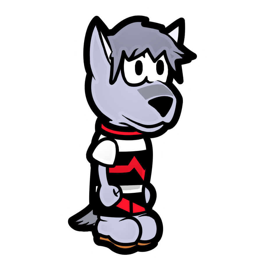
Guess it's my turn then. To be honest, I'm starting to lose my heart in drawing too, with all the IRL stuff pulling me down...
And when I tried something, this inadvertently came out...

The other guy is a wolf, still nameless... Only me and another person knows who he is, and I'll let it be that way.
Ruu, your fursona is awesome! And the inking style in the battle scene looks great too!
Nick, I'm glad you're drawing again! =3 The expressions look good too!
Souji, you're going to spam the place with Arctic foxes sooner or later... it's not a bad thing either! ^^
Psykeout, she looks like someone from this animated series, I just can't remember who...
Law, I agree with what Nitz said, you're planning to take over the world or something? X3 *bricked*
Box, regardless of the comments, I really like how you colour the lineart!
Guess it's my turn then. To be honest, I'm starting to lose my heart in drawing too, with all the IRL stuff pulling me down...
And when I tried something, this inadvertently came out...
The other guy is a wolf, still nameless... Only me and another person knows who he is, and I'll let it be that way.
Applegate Appearance Cheat Sheet
Haq Dzi'ab (Blue Peaks Shore) || Mikan Kawabe (Applegate) || Hajime (Apollo City)
Re: Art Thread
Her name is Aka Pella. She's olllddddddd. like, Animaniacs old.kurowolfe wrote:Psykeout, she looks like someone from this animated series, I just can't remember who... :?
You've got a good grip on eye expression I think.
I wan't GOING to post this, but I pretty much drew it at Sleet's request, so i figured I would anyways.
bwah bwah