Re: Art Thread
Posted: Sat Aug 20, 2011 12:29 pm
Aww, 's cute.
dogs and cats living together, mass hysteria
https://www.housepetscomic.com/forums/

Oh God, that would mean I need to be depressed to draw something like this again, since I always draw my current emotions out... @w@ But yeah, my friends, IRL or online, is my strength now. Thanks, Souji and thanks too, Psykeout and TH.Souji wrote:Kuro, as odd as it may sound, sometimes our best works come out in a spot of depression. It doesn't look like you're losing heart in drawing at all; it's a very powerful picture.
Let your friends be your strength.
 I redrew the old guy in blue ink ballpoint pen.
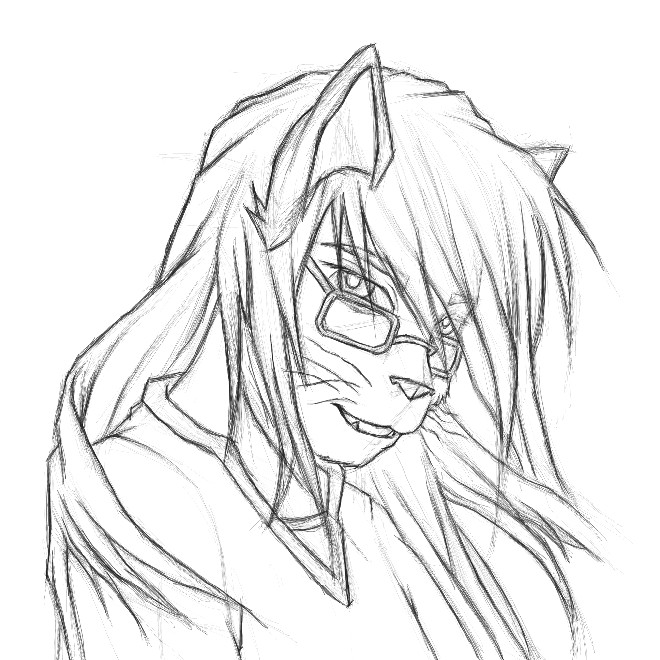
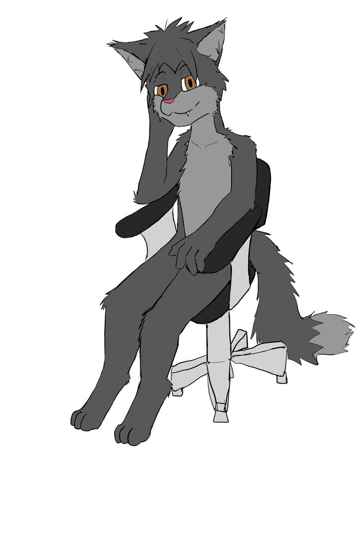
.Laxan wrote:Nice pose Shadow.
And nice Muro Sketches QRS3000
He's a doodle I did.
Old folks is difficult to draw, I can't for the life of meQRS3000 wrote:I redrew the old guy in blue ink ballpoint pen.
I think you're underselling yourself to call something a doodle if it's of that size and dimensionality (which is a word, Chrome)Laxan wrote:He's a doodle I did.

Except it's not a doodle.Laxan wrote:He's a doodle I did.
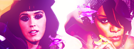
I think i just found myself a new wallpaper
the definition of a doodle is a drawing done when multi-tasking. Which I was. |DPsykeout wrote:Except it's not a doodle.
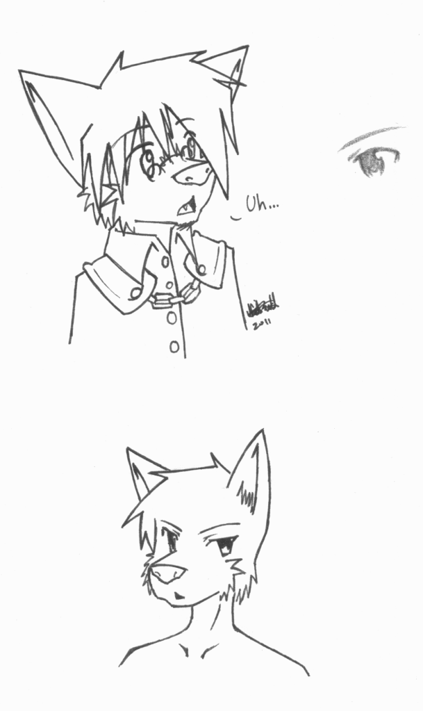
What you mean?Psykeout wrote:It looks reallllyyy nice. If a little uncanny.[/color]
he would look great in a blue robe.CaptainPea wrote:I OWN THREE LEGS
ah. The more you knooowwwLaxan wrote:the definition of a doodle is a drawing done when multi-tasking. Which I was. |DPsykeout wrote:Except it's not a doodle.
What you mean?Psykeout wrote:It looks reallllyyy nice. If a little uncanny.[/color]
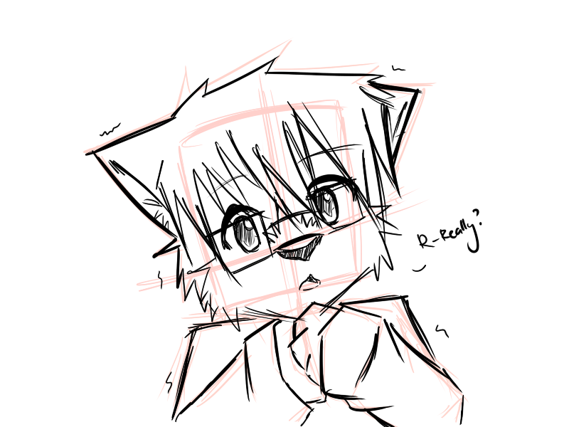
ATTACK OF THE GLASSESBox O Lions wrote:Because Pskyeout's amazing... he took me down. And he's happy 'bout it. X3
Then I'd use a little less manga elementsLaxan wrote:@Psykeout: Well that's just my style. I'm trying to get OUT of doing things too cartoony.
No you'll ruin the small reference pool.Sleet wrote:Psykeout, wanna share it? :P
Everything Sleet says is artPsykeout wrote:No you'll ruin the small reference pool.Sleet wrote:Psykeout, wanna share it?
Also that is in no way art.
I like how you taking over Precocious is a running joke over there.CaptainPea wrote:Hey guys look at meeeeee

Awwwwww. :3CaptainPea wrote:Hey guys look at meeeeeeEverything Sleet says is artPsykeout wrote:No you'll ruin the small reference pool.Sleet wrote:Psykeout, wanna share it?
Also that is in no way art.
Thanks Law! X3 I'm sorry it took such a long time to respond. A lot of those problems I realized but it's great feedback. After I finished these couple of pieces, I realized the importance of taking a break in your art. I admit that hand sucks. And I'm not too good at shading yet. Coloring is foreign, and I usually don't draw anime. I did try to stylize it for the most part but if it looks wonky, I supposed I didn't do it right. :/ Thanks for the tips though. I appreciate it.CY_Law wrote:Now this, is a not so brief comment. *TF2 sniper voice* *shot*yehoshua wrote:......and completly disregard this not so brief comment.
Some anatomy error, i see alot of people commented about the nose so I'll start there first, from this perspective, the naris(opening of nostril) need to be more obvious, take the eye level to waist level, you'll see what I mean. Next, shadow or not, the shadow casted by the nose is off, you have shown where the light source is, in this case, I assume it's from the front of the person, so this one should be obvious. Or other wise, you'll make the nose look droopy.Box O Lions wrote:Finished Commission!... except... he actually wants a ton of stuff altered that he shoulda mentioned when I showed him. -_- sorta mad about that. But the coloring is decent. I'm fond of the sky... but I'm still not on par with what I want. I'm getting there little by little.
Anatomy wise, again, from this perspective, you have to make the ala(the bulge on the side) on the other side shown, even if it's just a little, Since, you have to make the nose shape more solid, instead of smooth rounded, same goes to the nose bridge, it has a distinct shape. I can see you try to use shading to show the form, you'll need a better shape and contrast for that, just a suggestion.
Now move on to the eye, erm, I dunno how to explain this, but you have to understand the human skull shape, the eye situated in the socket, will usually have the brow extended out more, but not exaggerating it, it prevents from making the face looks flat. You'll find out just how "inside" your eyes are towards your brain, hope you get what I mean. And also, give the eye a shape as well, by altering how the iris and pupil look like, try to imagine stamping them on a ball.
Next, anatomy again, the mouth, actually, the whole face shape is kinda off, despite me saying the face ain't flat, but they're almost a surface when viewed in general, just some bulge and dent, in this case, you need to prevent drawing the face too rounded, from what we can see, the mouth is situated in a manner that it looks like it's way lower than the nose, which is an anatomy error. And you have to make sure the construction is correct, the placement of mouth is off if compared to where the eyes and nose are. In this case, the mouth would be higher up and closer to the left(from viewer point of view), from an almost 1/4 front perspective view, this is something you need to take care of.
And then, to the whole head anatomy, i say.... try imagining the person have his hair shaved, and imagine how the head is connected to the neck and the body, you'll see what i mean, the head is connected from its base, not from its back, just imagine the spinal cord connected the brain, easy reference, and again, make sure the head isn't round, it has a more dynamic shape, again look for reference.
Then, the hair, I say, good attempt, but you gotta show its volume, strokes are too soft in terms of colouring, I can see the shape, but not the form, making it not so convincing, as it can be misunderstood as a flat piece of paper, and also, show the contrast between each side of the hair, the lighting applies here as well, but nevertheless, good attempt as I'm not fond of drawing hair either, not even colour.
I wouldn't comment on the clothe, nothing much, aside from making it more contrast, since it's a white clothe.
And the right hand, the form is distorted, suggesting to find reference, best doing the gesture yourself, the palm being pressed needs to show its form correctly, I can see the attempt, but it's off. and the fingers...I assume it's a human error, but the fingers are poking/penetrating through the handle of the keyblade for some reason.
Next, I'll say this as an extra. Look at how he stands and how he positions his keyblade, he could be easily off-balance, but it's just something not *so* significant.
And well, over all you incorporate a soft shading method, which is ok, but it's better, for this case, for you to show some contrast, I assume it's sun light hitting on him, you'll have to simulate that, it's a tad way too soft, but it's just me.
And maybe add in more details, I know it's a commission and that you have to present it in a limited time. But simple stuff like, showing the bump where the hand-in-pocket is, will help, even by abit.
Overall, a tad shading problem, but a concerning matter is the line quality, you have to know for yourself which line is important and which line is not, it determines how the strokes is applied, Ex. stuff under shadow have a heavier and thicker line. Outer line is thinker than line for details, etc. It helps show the form easily and *not* confuses the audience, most of the time. Vector outlining or pen tool outlining is great, as it simulates pressure, but you gotta take care of the strokes as well, make sure it looks convincing, instead of letting the audiences wonder which line indicates the outline, and get confused by the form and structure, giving a false illusion of volume. And still, be flexible in this, you'll never know what went wrong until you finish it, most of the time.
Overall, I have nothing else to say, still, a good attempt, since quite a number of people points out stuff about it, just pointing something out as well.
Note: 1)If everything you did is stylised and is for a purpose, then... ignore what I said, but might be helpful for others
2) I typed this as I go, so it might be slightly inaccurate or even missed out something, I apologized about that
3) So that said, if there's anything I said that you don't understand or wish to ask, I'm here
4) I know I did threw lots of gibberish technical stuff, most of the people get offended by it, so no offence despite of what I said
Ironically how I just mentioned about line quality(I started this comment before you post this lol xD), this is close to what I meant, good attempt, but still, there's still some error here and there about the line, which, I'll leave it up for you to find it out yourself. It's a very important aspect to show an uncoloured detailed work, applying the correct line, in the correct place. The thing is it's uncoloured, which in turn, line quality took on the role of determining the shape and form, letting the audience know what they're looking at is convincing enough.Box O Lions wrote:I've been getting faster and faster at inking. This one took me an hour maybe, if less. Looks pretty good. I've learned that altering the line weights is very important to get a good look. I meant to add a laser beam growing in his paws like from Super Smash Bros. Brawl but I forgot and I'm a little tired. ^^' Hope you like it.
But otherwise, it looks good, I usually won't say much about stuff non-human. but oh well.
Again, no offence. |D
Sure, feel free. It's been A while since I've drawn him but I have a simple Basic design drawn. The black figure in the back is a sheath for a silver lance. I didn't do the designs on the coat here, that's a new addition. And since he's still a bit childish, he's not very muscular and not very trained when using his lance. Actually, I don't remember why I even gave him a lance the first place. Probably to whack creepers and magikarps 1000's of miles away. I Made a ME GUSTALaxan wrote:Manawolf? Can I perhaps draw your fursona? I like the look of him.